MY:MS
Introduction:
My husband was recently diagnosed with Multiple Sclerosis and since his diagnosis, I have seen how much information he has to manage and remember, often for a lot of different people/departments. As ‘brain fog’ is one of the main symptoms of MS, thinking and planning can be extremely difficult and frustrating. I knew with my knowledge of the condition and understanding of UX/UI design that I could create an app that would make life much easier for those with MS and help them track important information.
Objective:
To design the iOS and Android version of a mobile app of your choice that solves a specific user problem.
My Process
Define
Project Proposal and MVP
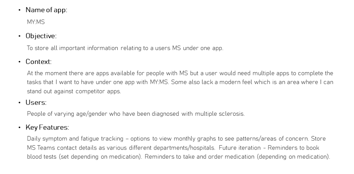
The first step of any project is to set out who the app will be used by and what they need the app to do. Whilst doing this it became clear that some of my features would be something that would be released in a second version of the app and was not needed during the initial for the MVP. It was important to focus on the main use of the app and not get carried away with adding all the features that I would love to add.
Ideate

User stories, user flows, user flow diagram
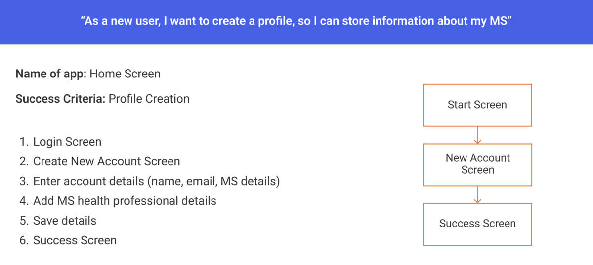
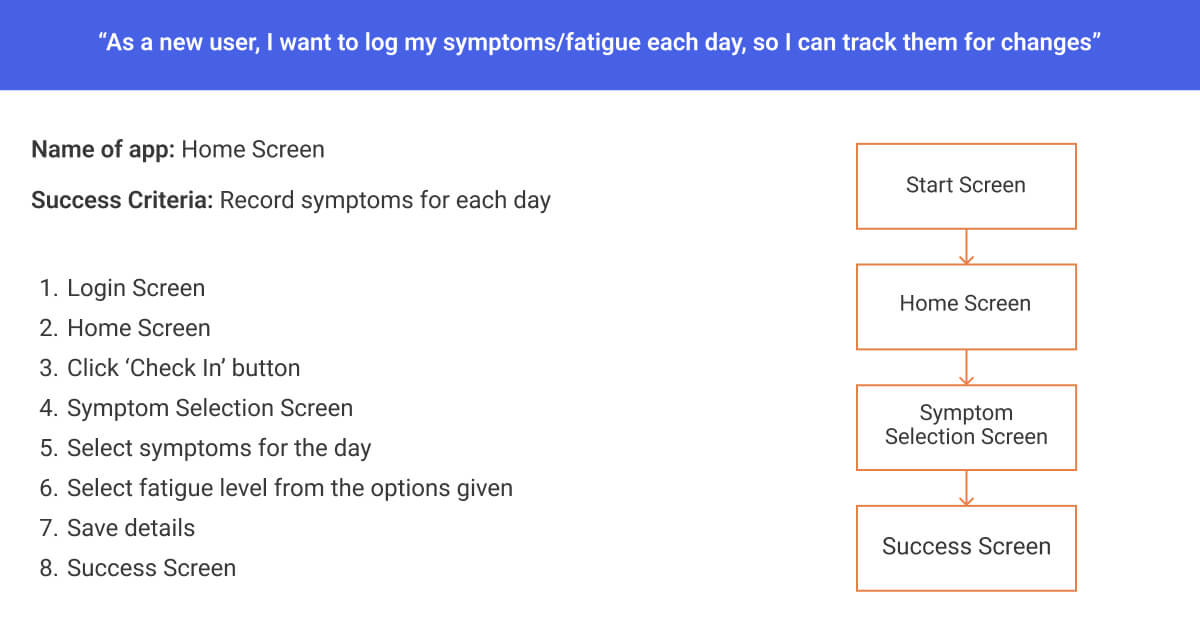
After deciding on the features needed for my ‘Minimum Viable Product’ I used user flows to ensure that I didn’t miss any screens that the user needed to see to complete the goals in the JTBD.
As part of the process of this app is to store important information about a user’s MS, I chose to focus on the signup process for the user and also the flow of a user logging their symptoms for a day. I find this part of the process helps to make sure nothing is forgotten when I start to create my wireframes.
Design
iOS Wireframes
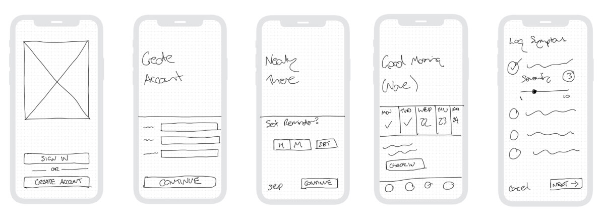
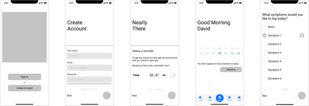
Android Wireframes
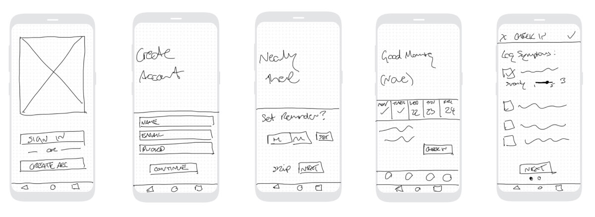
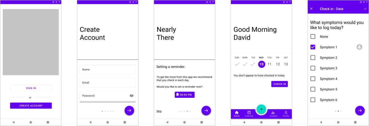
Low-Fidelity and Mid-Fidelity Wireframes
To begin my wireframes I firstly used the Crazy 8 method used in a previous project to quickly sketch ideas for how I wanted the screens to look.
From this, I then created low-fidelity paper wireframes and then converted these into digital format.
For this project, we were to design for both iOS and Android formats, and as someone who has only used Apple products, I found this quite challenging. Luckily the Material Guide was a huge help to ensure I was following the best practices of UI design.
Iteration and Handoff
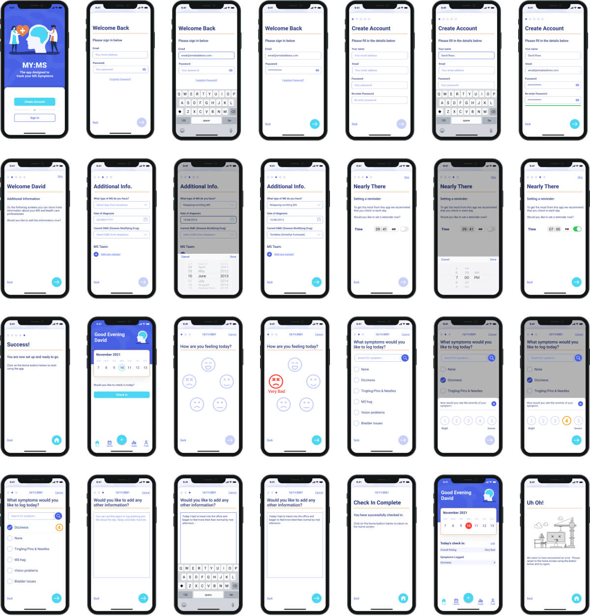
iOS Mockups
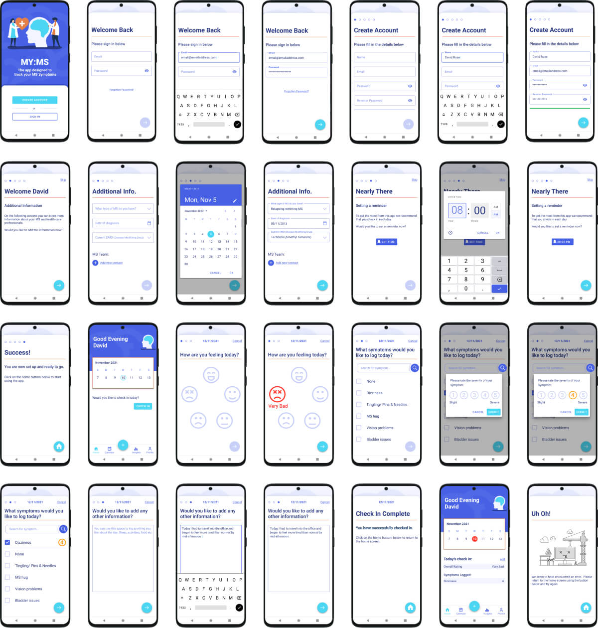
Android Mockups
Final UI Design
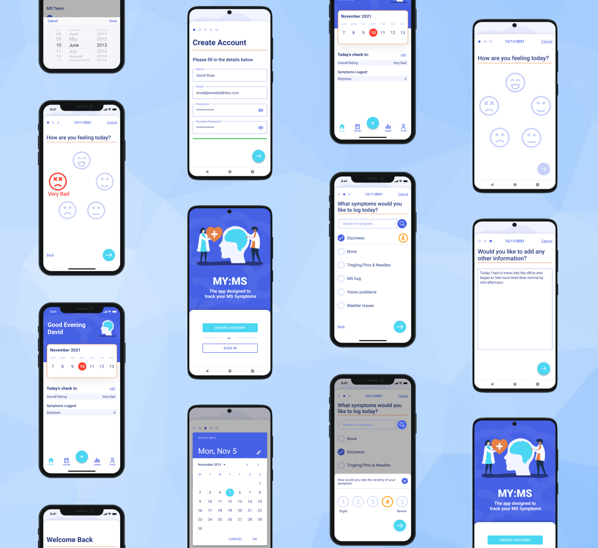
My completed design had 10 complete screens and all assets were exported ready to be passed to the development team. For the purpose of this case study I have shown the same 4 screens throughout this document, along with the mobile mockups of all screens.
Reflection
What did I learn?
After submitting my prototypes for user feedback there were things that I had missed or hadn’t thought about and it was really good to get some fresh eyes to look at the design. This helped me improve on the final design by bringing any issues to my attention before final submission. This highlights the importance of asking others for feedback to make the finished product the best it can be.
Improvements
I would like to have done user interviews during the ideation phase to ensure that the app I am designing is based on what the user wants and not what I think someone with MS would want from an app. User interviews were not part of this course section however they would have been valuable for this project.
Next Steps
For further iterations of the app I would like to design functionality/screens for the following:
- Insights – user can view daily/monthly graphs to monitor areas of concerns
- Reminders to book blood tests (based on medication added in users profile)
- Reminders to take and order medication (based on medication added in users profile)