Rubix
Introduction:
This app was my very first project as a UI/UX Designer. As a lover of music and someone who was born in the 80s, it was an easy choice for me to make between the project briefs.
Objective:
To design the UI for an 80s music player mobile app and prepare for handover to developers.
My Process
Research

Competitor Analysis
It’s important to look at competitor apps to find out what they are doing well and what areas can be improved. I chose to look at Spotify, which I use daily, and SoundCloud. From this analysis, I created a list of functions to include in my app.
Ideate

Low-Fidelity Wireframes
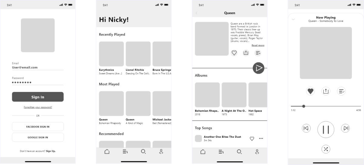
After deciding on the main functionality of the app, I began to start designing my low-fidelity wireframes. This was to get the initial layout ideas down on paper. For this project, I opted to use pen and paper for these wireframes but have since learned that I prefer using my iPad for ease of erasing/layering.
Mid-Fidelity Wireframes
The next stage was to convert my paper prototypes into digital wireframes. As this was my first design project, I chose to use Adobe XD and although I didn’t have much experience with the programme, I found that this project was a great way to get to grips with it.
Design
Inspiration Board
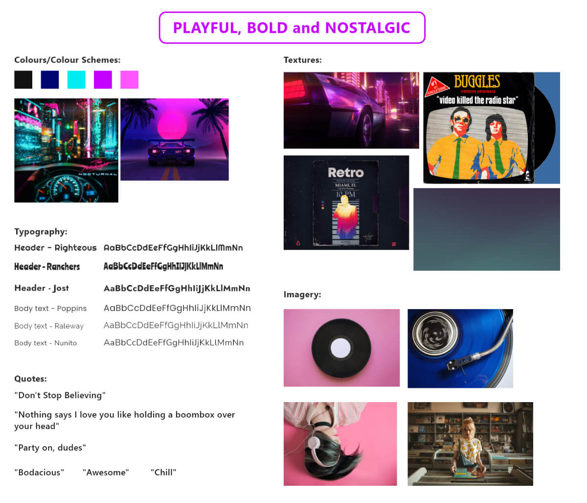
Before applying colour to my wireframes, I created an inspiration board to help decide on finalised components for my stylesheet. This included colours, textures, imagery and quotes. The strong vinyl record presence here influenced the app logo and also the login screen. I wanted the app to feel playful, bold and nostalgic.
Stylesheet
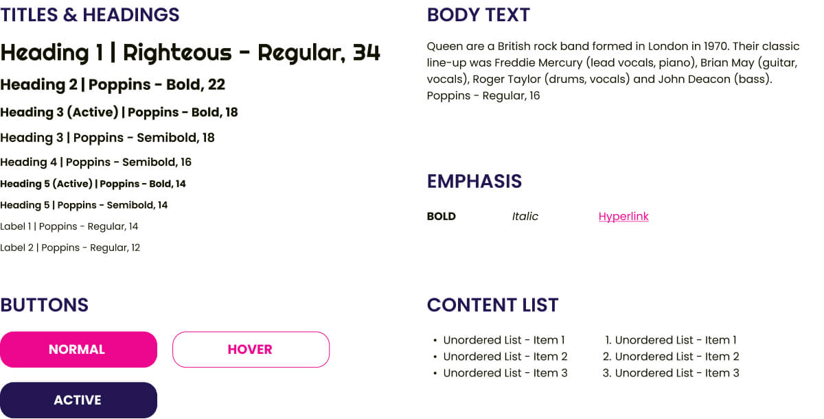
From the inspiration board, I then created a style sheet. This finalised font, colour, and element choices. This is then used for branding purposes and cohesion throughout all products.
Handoff
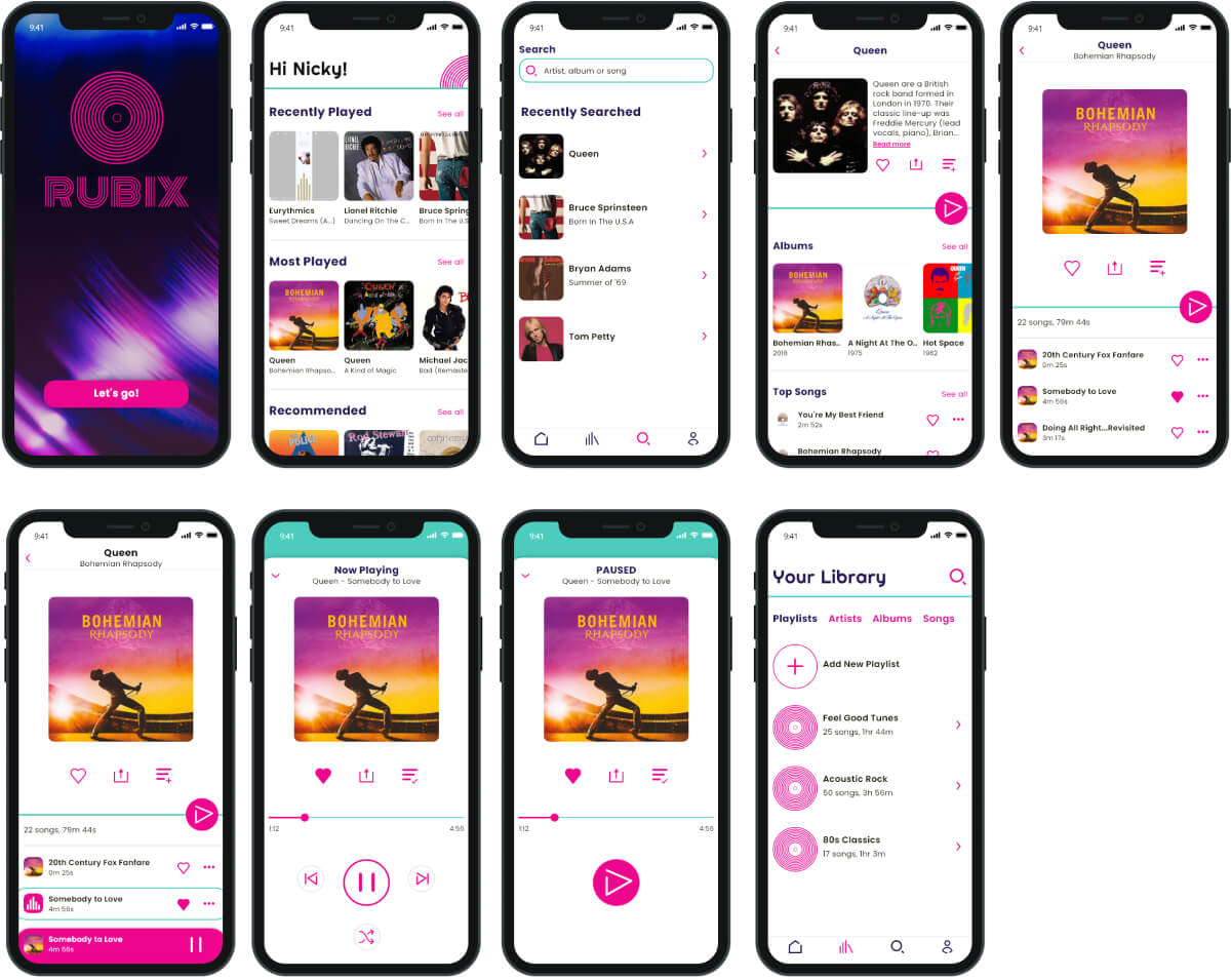
Final UI Design
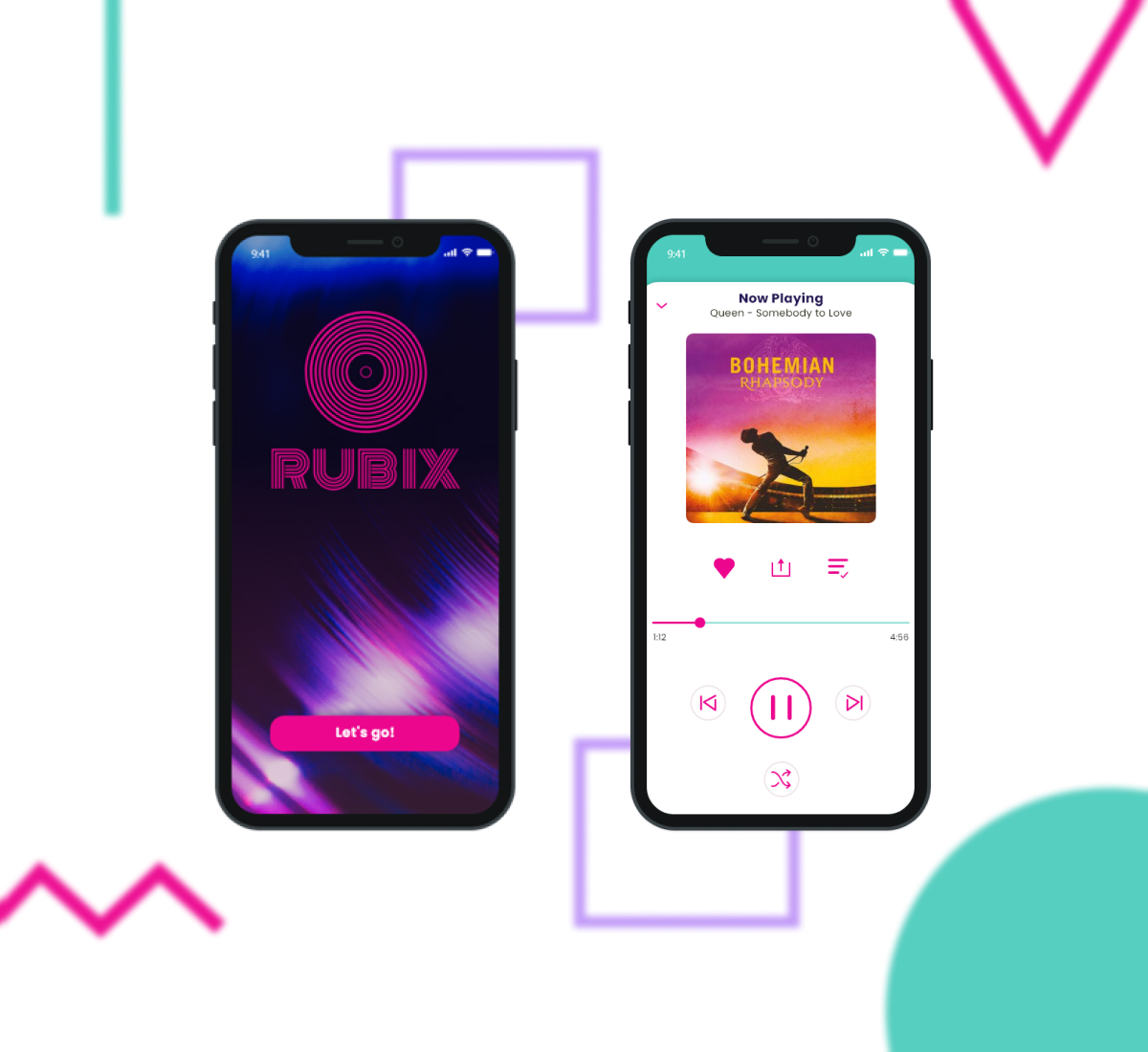
My completed design had 10 complete screens and all assets were exported ready to be passed to the development team. For the purpose of this case study I have shown the same 4 screens throughout this document, along with the mobile mockups of all screens.
Reflection
What did I learn?
I think the biggest thing I learned from this project was that your first ideas aren’t always going to be your best and it’s important to explore different options. This was mainly brought to light when I was applying my colour palette. Although my initial idea looked great as individual squares, when it was applied to my design it became quite overwhelming and distracting to look at.
Roadblocks
Applying the colour for this project, as it was my first as a UI designer, proved to be a big learning curve. How I imagined the app would look at the beginning of the project and how it was looking once I applied the colour palettes were very different. I spent too much time procrastinating at this stage. To get around this I toned down the colour palette that I had originally thought of and applied two different versions to two of the screens (dark and light). I then asked my mentor for feedback on what one worked better and then applied that one to all my screens.